My colleague Ryan and I partnered up for a project and chose to redesign the energy.gov webpage. Due to the increase in environmental issues, we feel it is important that the information within this website needs to be more accessible to all. For this case study, we did interviews, and user testing of the original site, found common pain points and main our redesign around those issues
User Testing

Rebuilding Navigation
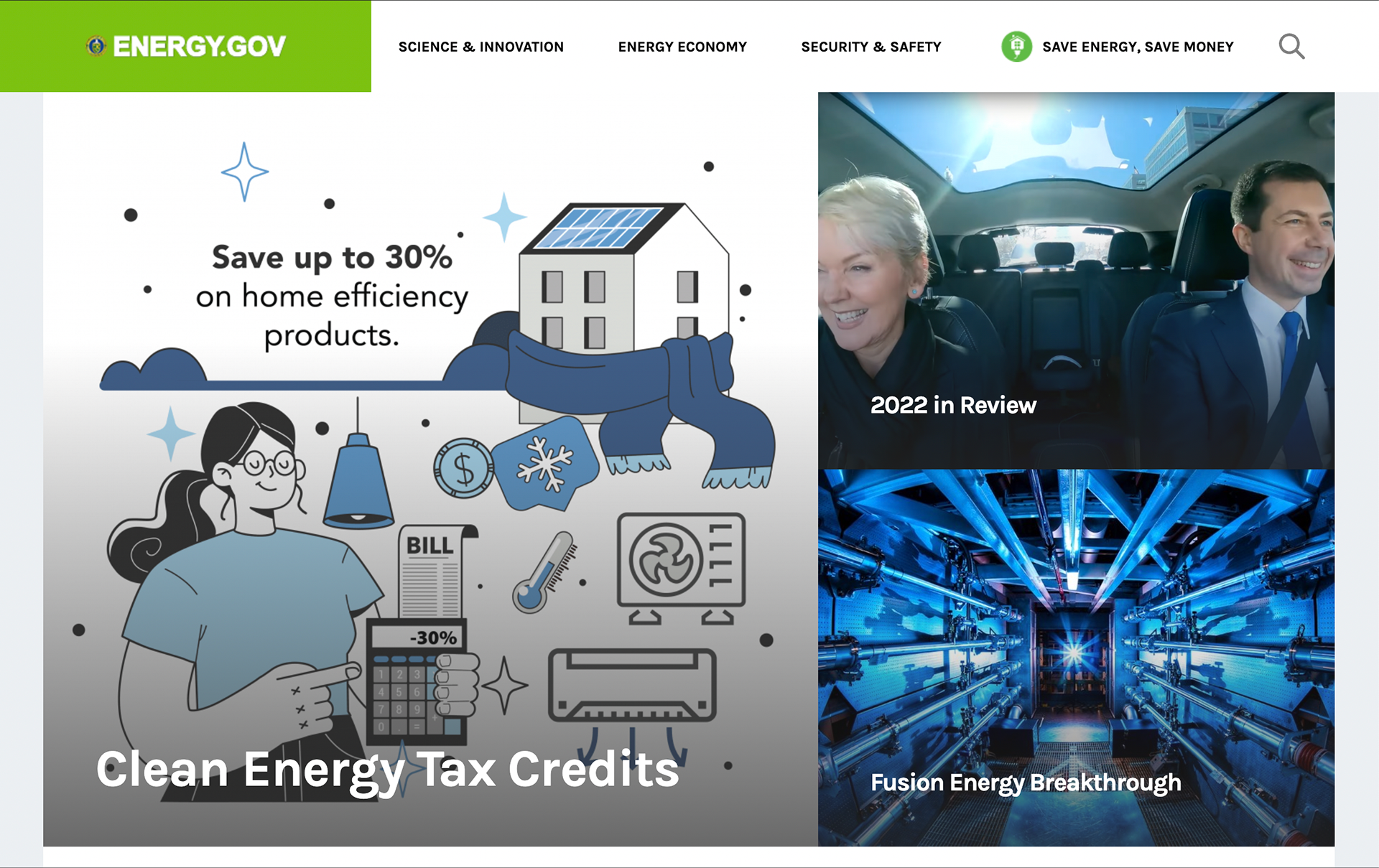
Focus on Users Wanting to be Energy Efficient
First, we created some tests for people to complete to test the functionality of the old webpage. Next, we began completely rebuilding our navigation by completing card sorting and compiling user testing data.
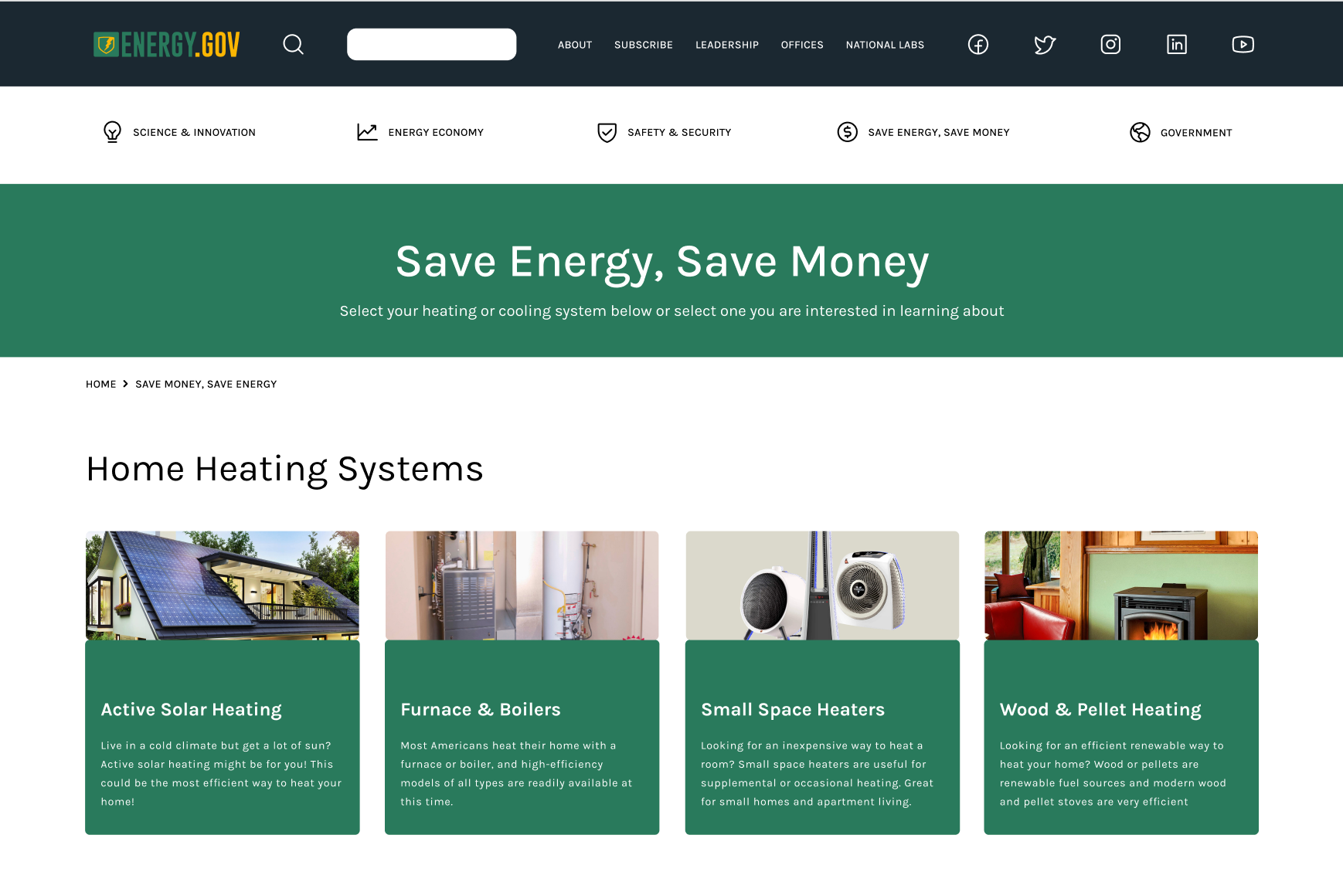
After this, we wanted to help users be able to find how they can be energy efficient in their own homes and lives.
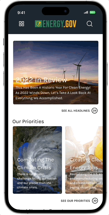
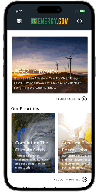
Another big priority in our redesign was the mobile experience of Energy.gov. Their previous webpage did not consider a mobile experience. It visually looked like a mobile experience but its webpage navigation did not translate well into a mobile screen size. The navigation had to be completely rebuilt to function well on a mobile device. That being said, our webpage navigation and mobile navigation are slightly different.
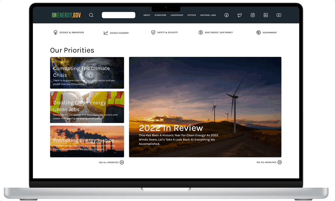
Below, shows our design steps for building out our webpage design. Starts with very simple and basic wireframes. Next, we reworked the main navigation and added global navigation within the header. Redesigned their logo and placed their priorities front and center for new users to see. Then lastly, our final full UI design prototype with functional navigation dropdowns.
Iterations
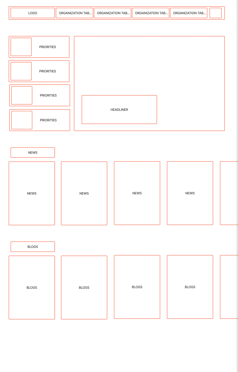
Wireframes

Wireframes + UI Elements
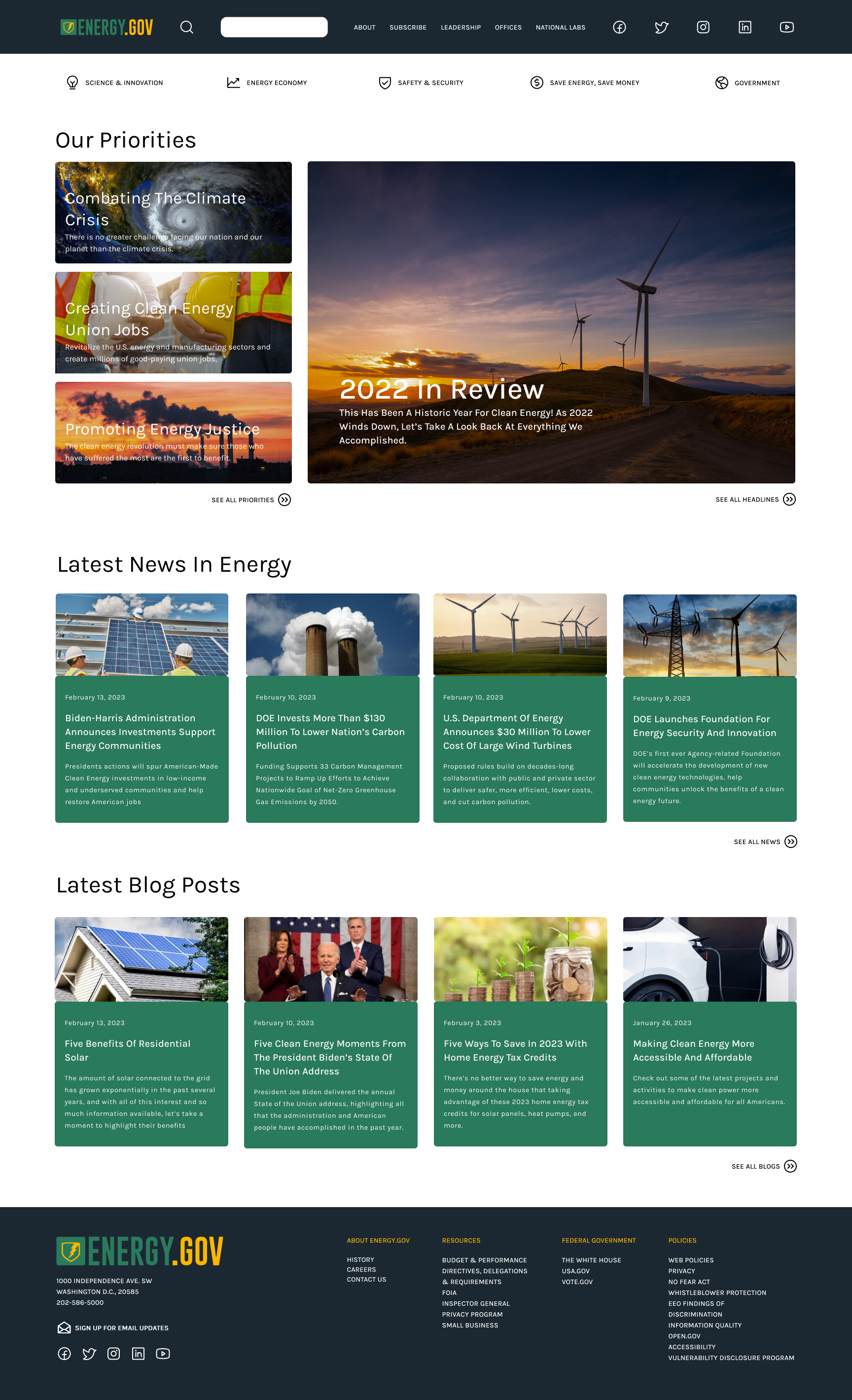
Full Final Design
Before and After Home/Landing Page
Before
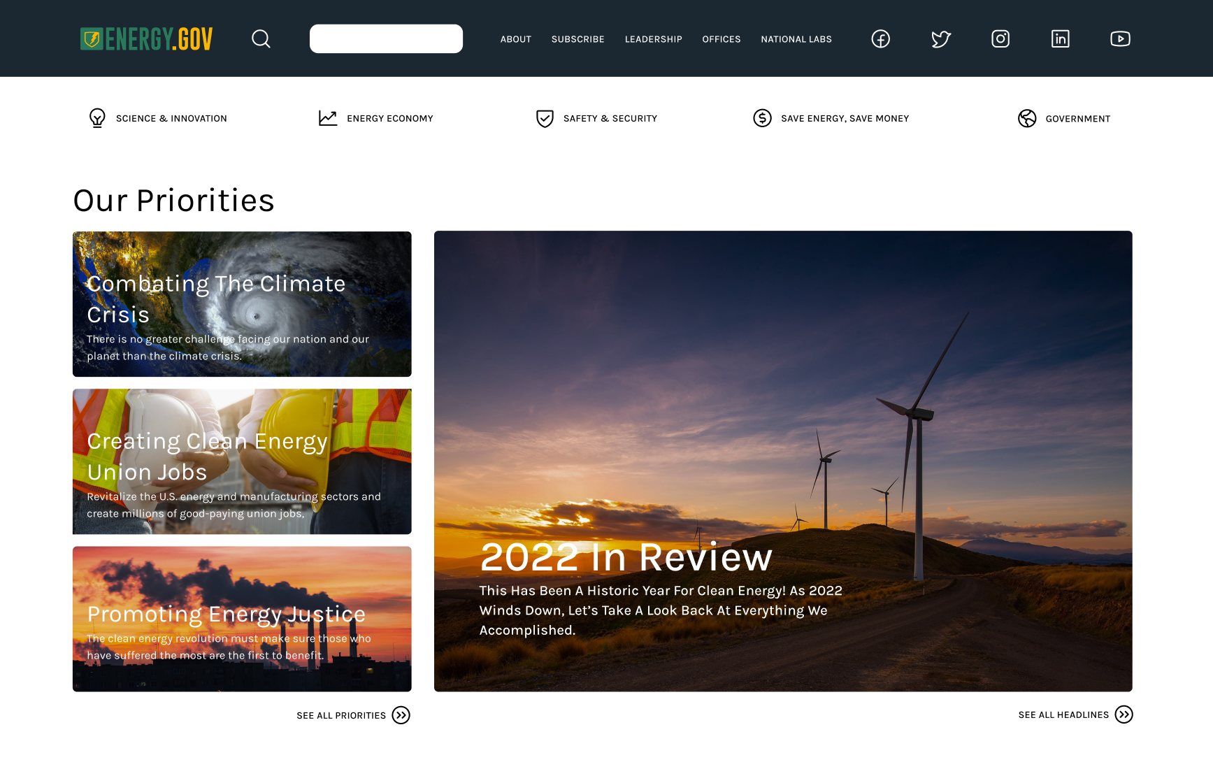
After
Final Prototypes